Plotting in the epistasis package
The epistasis package comes with a few functions to plot epistasis data.
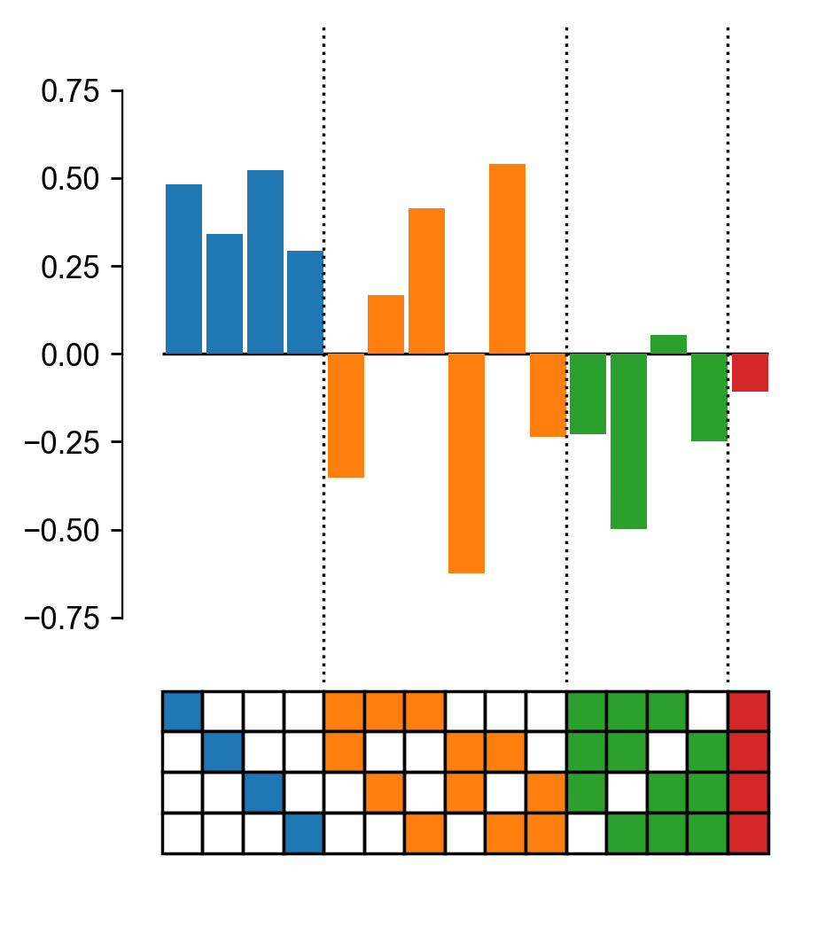
Plot epistatic coefficients
The plotting module comes with a default function for plotting epistatic coefficients. It plots the value of the coefficient as bar graphs, the label as a box plot (see example below), and signficicance as stars using a t-test.
import matplotlib.pyplot as plt

from gpmap.simulate import MountFujiSimulation
from epistasis.models.linear import EpistasisLinearRegression
from epistasis.pyplot.coefs import plot_coefs

gpm = MountFujiSimulation.from_length(4, field_strength=-1, roughness=(-2,2))

model = EpistasisLinearRegression(order=4)
model.add_gpm(gpm)
model.fit()

# Plot coefs
fig, axes = plot_coefs(model, figsize=(4,5))
plt.show()
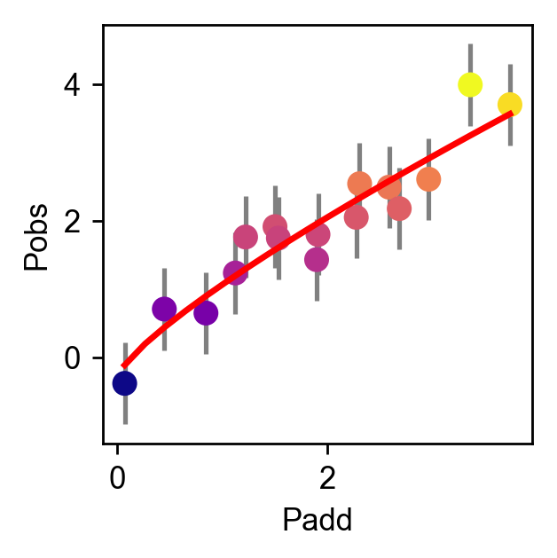
Plot nonlinear scale
Plot a nonlinear scale using the epistasis.pyplot.nonlinear module.
# Import matplotlib
import matplotlib.pyplot as plt

# Import epistasis package
from gpmap.simulate import MountFujiSimulation
from epistasis.models.nonlinear import EpistasisPowerTransform
from epistasis.pyplot.nonlinear import plot_power_transform

# Simulate a Mt. Fuji fitness landscape
gpm = MountFujiSimulation.from_length(4, field_strength=-1, roughness=(-2,2))

# Fit Power transform
model = EpistasisPowerTransform(lmbda=1, A=0, B=0)
model.add_gpm(gpm)
model.fit()

# Create plot
fig, ax = plt.subplots(figsize=(3,3))
plot_power_transform(model, cmap='plasma', ax=ax, yerr=0.6)

ax.set_xlabel('Padd')
ax.set_ylabel('Pobs')
plt.show()